Friday, May 6, 2011
Illusion of Motion by Multiple Image
This series of photographs of a ballerina have been strategically strung together to imply motion from the first to last image taken. Though individual pieces do not imply motion on their own, the series as a whole evokes a sense of motion that cannot be accomplished by its individual parts.
Illusion of Motion by Blurred Outline
The unclear outlines implies quickness as the runner's move past the camera. The centralized figure is the focal point because she is the most clear of the 3 featured runners.
Illusion of Motion by Repeated Figure
Aside from the relevance of the imagery as the Kentucky Derby is rapidly approaching, this image gives the illusion of motion as a race horse runs around the track. We imply motion from the differences in the horses legs from one individual image to the next.
Anticipated Motion
The lifted leg and bat hovering over the back shoulder anticipate the batter's swing as he anticipates a pitch in the strike zone. The catcher is also anticipating catching the ball if it happens to go past the batter.
Spatial Puzzles (Equivocal Space)
The chaos taking place in this painting's activity makes it difficult to differentiate the foreground from the background, which is an example of equivocal space.
Multiple Perspective
This drawing exemplifies multiple perspective in the way that it combines the woman's profile view with her frontal view. While both are impossible to see simultaneously, realistic principles of human anatomy are broken to allow both to co-exist.
Amplified Perspective
Amplified Perspective occurs "when an item is pointed directly at the viewer." What once was a simple building, is now a dramatic image with a unique and interesting vantage point.
Illusion of Space by Linear Perspective
Though held to a confined space, the strategic usage of lines fading into what we call the "vanishing point" provides the illusion that this bridge extends beyond what the eye can see.
Illusion of Space by Aerial Perspective
From an aerial view, this parking lot gives the illusion of having a series of hills and curvy lines. Though we know parking lots to be flat in our experience with them, this aerial perspective suggests otherwise.
Illusion of Space by Vertical Location
While each character is in motion, we cannot decipher the distance between each of them. The vertical angle we have gives the illusion that the figures are stacked on top of each other, but we know this is not the case. A side angle would help with the understanding of depth within this piece.
Illusion of Space by Overlapping
The famous Pyramids of Giza are a good example of Illusion of Space by Overlapping because the viewer cannot tell the distance between each pyramid from this angle. While it looks as though each pyramid is connected, it is simply the illusion that causes us to come to this conclusion, being uncertain of the depth of each object.
Scale Confusion
This example from my hometown depicts the famous "Louisville Slugger" baseball bat as being the size of a building. This is a fun example of scale confusion that has personal meaning to me. While the architecture is not to suggest that bats are as big as buildings, it may be symbolic of how big of a brand the "Louisville Slugger" has become.
Alternating Rhythm
The rhythm in this design alternates between white boxes and black boxes as the focal point of the piece. Both motifs work together to form the whole, but the alternating designs keep the eye always seeing the piece a bit differently.
Progressive Rhythm
Depending on how you look at it, the progressive rhythm of this piece has its images getting smaller and smaller or larger and larger throughout. The repetition of similar shapes in this pattern is constant as it builds up or shrinks.
Absence of Focal Point
This brick wall pattern lacks a distinct focal point because the pattern is the same throughout. Nothing about the pattern draws the eye, which forces the eye to view the pattern as a whole.
Degree of Emphasis
Advertisers, especially designers of billboards, understand what draws first attention of the viewer and what is seen at second glance. In this particular ad the degree of emphasis is as follows: the primary focal point would be the image of the dinosaur because people are more inclined to view images before reading text. The secondary focal point would be the large text to the right of the image due to its size and direct relation to the image just seen. Lastly, the tertiary focal point would be the website at the bottom of the billboard where small text is used to differentiate the ad from the fine print information further explaining the ad's message.
Emphasis by Placement
Commonly seen in sports, the above image places emphasis on the hands piled one on top of the other. The eye is drawn to the hands as the focal point because it is the center and the arms lead the eye to the centralized figure. This image is also a good example of radial design.
Emphasis by Isolation
The focal point of the above image is the cat found seperated from the group. While all of the essential pieces are identical (cats), the isolated cat draws the attention of the eye.
Emphasis by Contrast
The simple use of color contrast in this pattern makes the yellow figure stand out as the focal point of the total body of work.
Crystallographic Balance
This image, better known as an allover pattern, uses elements of repetition and symmetry to create this unique visual or pattern.
Radial Balance
Radial balance occurs when "all the elements radiate or circle out from a common central point" as shown by the dome ceiling or firework.
Asymmetrical Balance
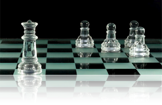
All images are asymmetrical in the way that the individual elements permit equal eye attraction from the viewer. While different, the parts are similar enough to read as a whole in a unified way.
Symmetrical Balance
Symmetry simply means that the object can be split down the middle to have two identical sides. The object can be folded over itself to mirror the opposite piece of the whole. The butterfly is a clear example of symmetry in nature.
Value as Emphasis
This image uses value to emphasize the central figure or focal point, the man jumping. The dark silhouette on top of a white background leads the eye to the man, properly executing emphasis through value.
Value as Pattern
A pattern is achieved between the bright colors at the forefront and dull backgrounds of the image where the contrast works well. Even the bright objects follow a messier theme brought out in the overall body of work.
Rectilinear Shapes
This image clearly executes a series of right angles and rectangular planes to give it a rectilinear composition.
Nonobjective Shapes
Both of the above images are nonobjective because neither attempt to mimic any specific object in nature. The shapes are free flowing and completely original pieces of work.
Abstraction
This abstraction image attempts to simplify music with visual imagery of instruments and basic shapes. As the shapes interact, they form the more sophisticated whole made up of individual simplistic shapes and objects.
Idealism
The famous statue "The Thinker' exemplifies the standard of perfection that idealism strives to achieve. The strong proportions suggest physical strength and strength of the mind working together to create this masterpiece.
Distortion
The women depicted have distorted or exaggerated faces to evoke a certain feeling or response from the viewer. Distortion is often used to carry a message beyond the limitations to which naturalism must conform
Naturalism
This painting of a fox chasing a rabbit holds consistent with the idea of naturalism in correct proportion and visual representation of nature. Naturalism is about the reproduction of realistic visual imagery, which this painting communicates beautifully.
Lost and Found Contour
Because of the painting's dark background, much of the human anatomy at the forefront has been faded or hidden within. But given the terms lost and found contour, the viewer is able to continue the line visually as if it were just as clear as the rest. With lost and found contour, we understand that the man leaning over the man on the ground is not a floating torso, but attached to the legs that are disguised in the dark value surrounding him.
Line as Value
This image of fruit uses a cross-hatching technique to create value (areas of dark and light) where shadows add density to what once may have seemed simply contour and shallow.
Gesture Line
While at first this drawing seems to be depict a series of unorganized scribbles, it becomes apparent that it uses gesture lines to show action. These two boxing figures are throwing punches, showing movement and free form that is consistent with gesture drawings.
Contour Line
This drawing of a shoe (or boot) exemplifies contour style because it emphasizes outlines to form the overall shape. Lines guide the eye to see the hollistic piece, the shoe.
Line as Emotion
Aside from the obvious comment that Donald is angry, line has a lot to do with evoking such emotion. Playing off of real human emotion, cartoons are able to exaggerate emotions such as "anger" by lowering eyebrows and using diagonal lines to add a sharpness to it. Donald's sharp hair and tail add to the feeling of anger, all of which is accomplished with line.
Line Direction
The horizontal lines of the buidling's architecture imply both rest and tranquility. We are able to make the visual connection that the building is not in motion but still and sturdy in it's design.
This painting on the other hand, is full of diagonal line direction and a feeling of movement in the figures. While we may fully understand basketball to be an active sport, the diagonals emphasize movement and action in a way that vertical or horizontal lines simply fail to do.
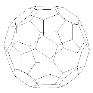
Line as Shape
The lines in this image work together to form a series of pentagonal shapes to create an overall body of work, or geometrical shape.
Subscribe to:
Comments (Atom)


